Last week we told you what is hidden in our logo — four stars growing by the golden ratio, each sliced by an exact power of 1/φ. This is the other half of the story: the eighteen months of pencil sketches, dimension sheets, whiteboard geometry, 5 a.m. research sessions and one star weighed out like a recipe that it took to get there. We kept everything. Here is the paper trail.
Chapter one: a pencil and a bad idea that wouldn’t leave (September 2024)
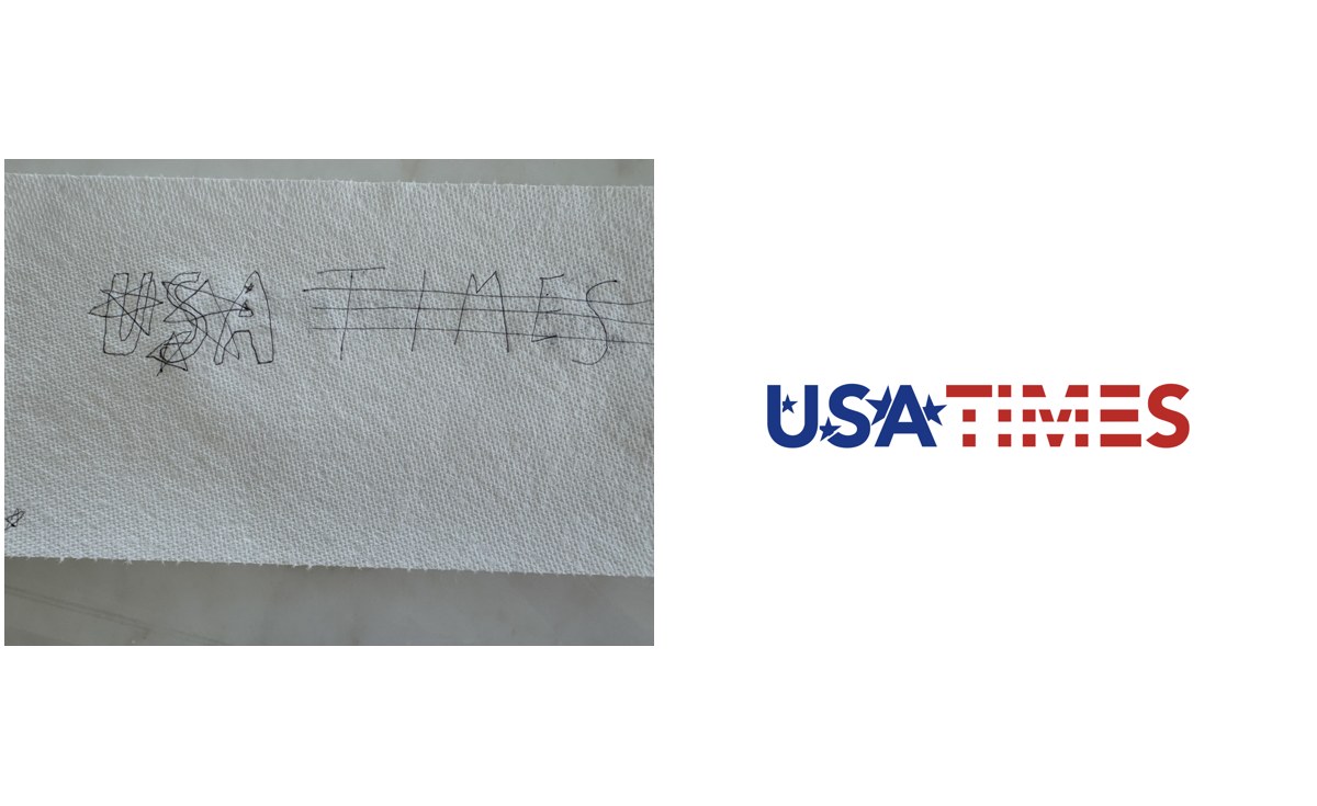
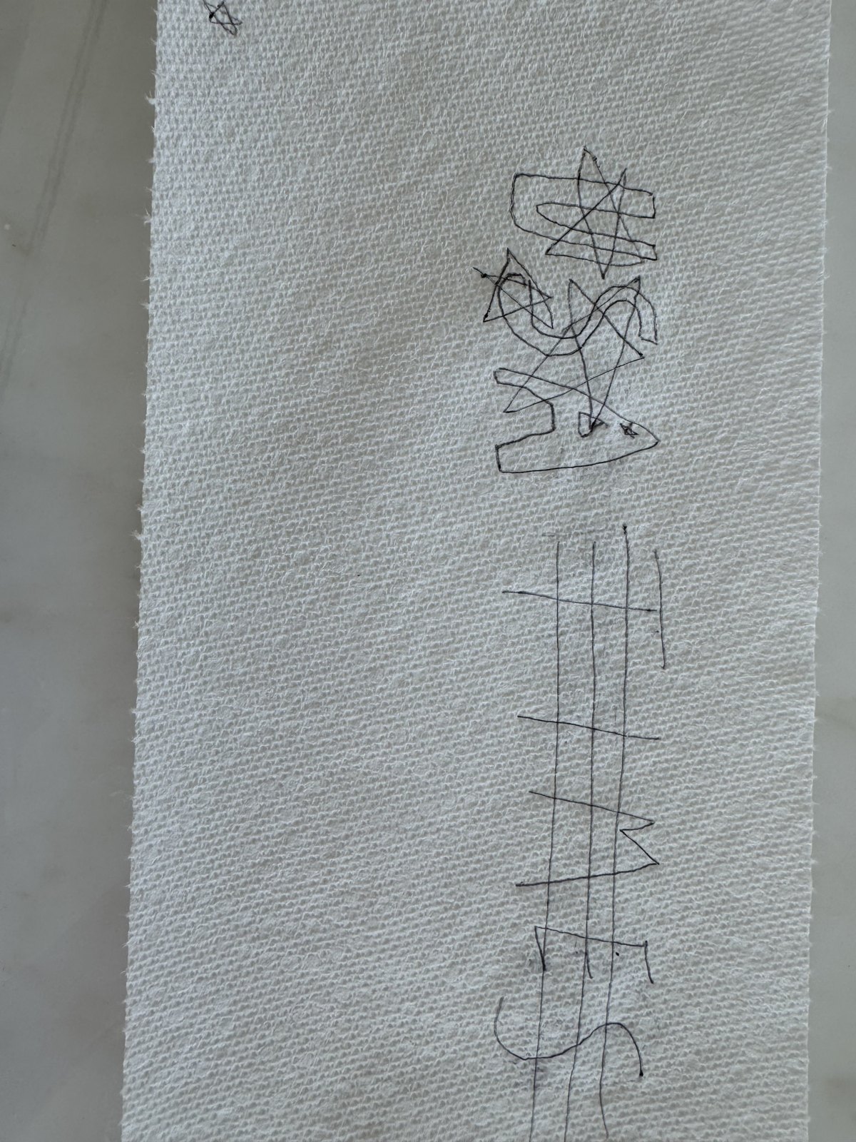
Every identity story claims it started on a napkin. Ours actually did — or close enough: a strip of paper, a pencil, and the words USA TIMES drawn in wobbly overlapping capitals, the A already wearing a star for a crossbar. No ratios, no grids. Just the instinct that the name and a star belonged to each other.
Chapter two: the first digital draft (November 2024)
Two months later the sketch became pixels: a heavy slab wordmark, blue USA, red TIMES, a star tucked into the lettering. It looked like a newspaper. It did not yet mean anything — the star was decoration, which for this newsroom is a temporary condition.
Batmandir · Founders A numbered seat at the table. S3 · The Founders Club — 161 seats per location. By invitation. Explore membership →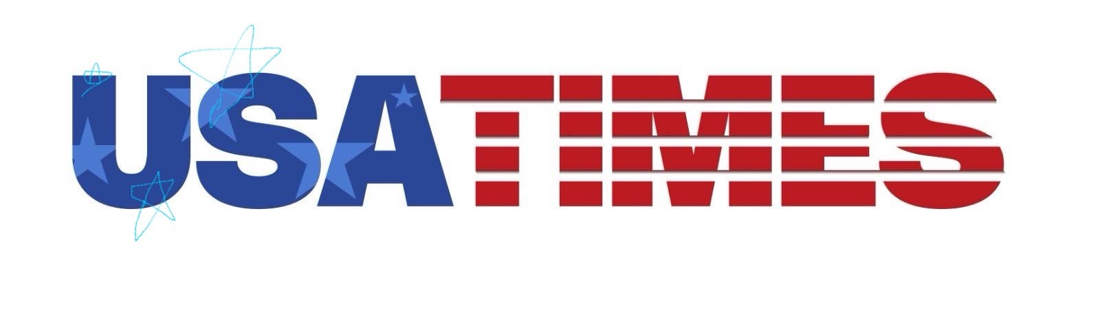
Chapter three: the wordmark becomes an engineering drawing (April 2025)
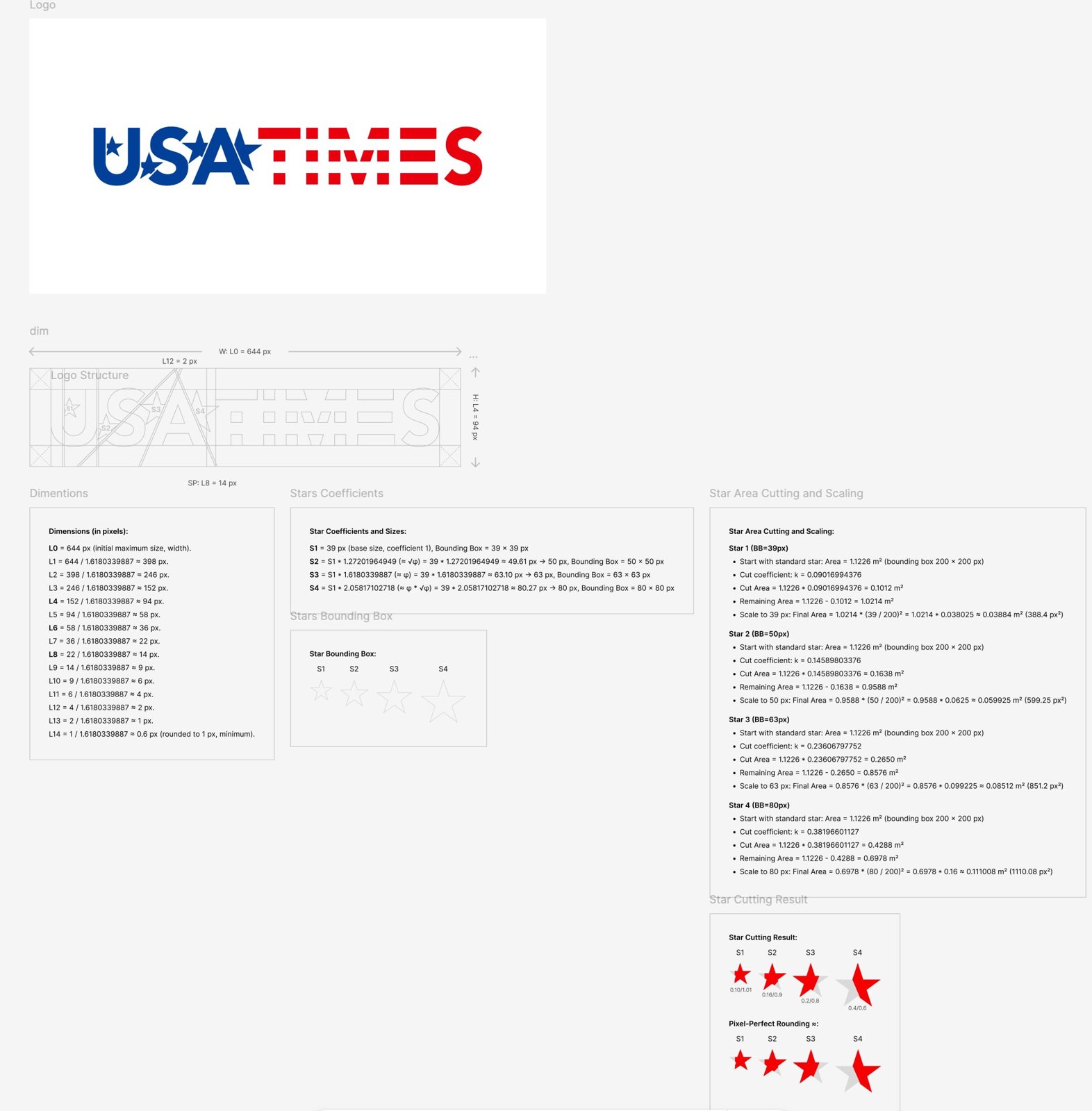
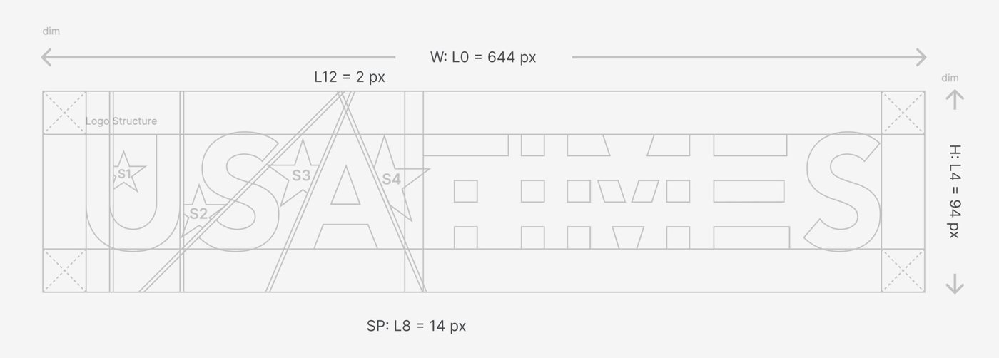
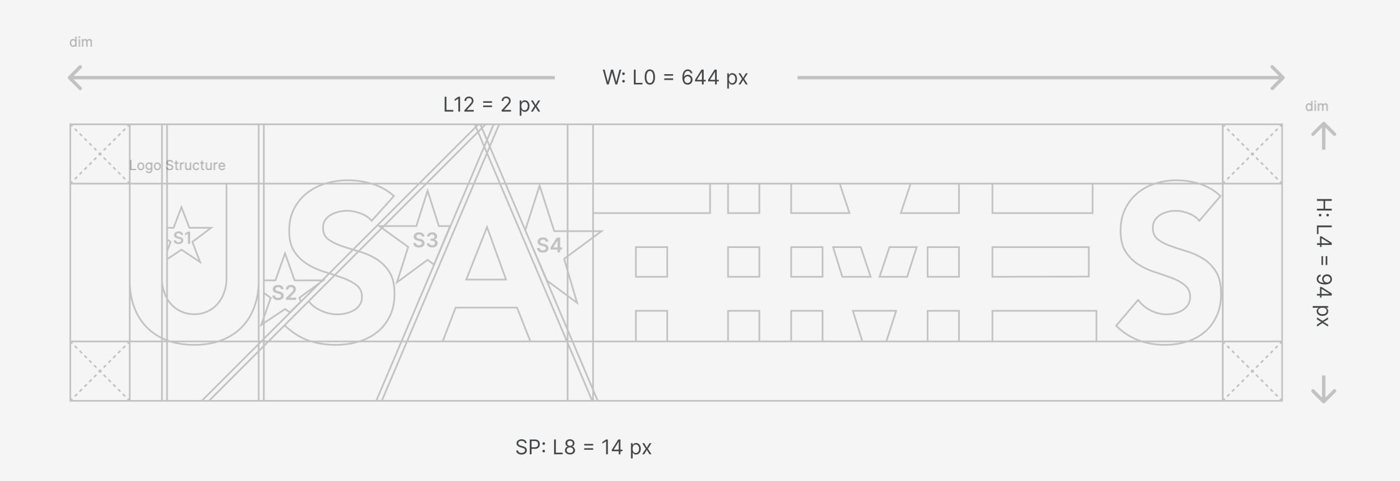
Then the measuring started. By spring the logo had a full specification sheet, drawn like a machine part: overall width locked at 644 pixels, stroke units of 2, letter-spacing of 14, every star given its own bounding box, and a panel headed Star Area Cutting and Scaling. This is the moment the four stars stopped being ornaments and became a system — S1, S2, S3, S4, each with a defined size and a defined cut.
Look closely at the dimensions column and you will find the golden ratio was already running the show, a full five months before we formalized the star cuts: the spacing scale is one long ladder of divisions by φ — 644, 398, 246, 152, 94, 58, 36, 22, 14, 9, 6, 4, 2, 1 pixels, each step the previous one divided by 1.6180339887. Even the star sizes are set as S1 = 39 px, S2 = S1·√φ, S3 = S1·φ, S4 = S1·φ√φ — which is exactly what makes their areas grow by φ. The whole wordmark, letter-spacing included, is golden.
Chapter four: first production cuts (May 2025)
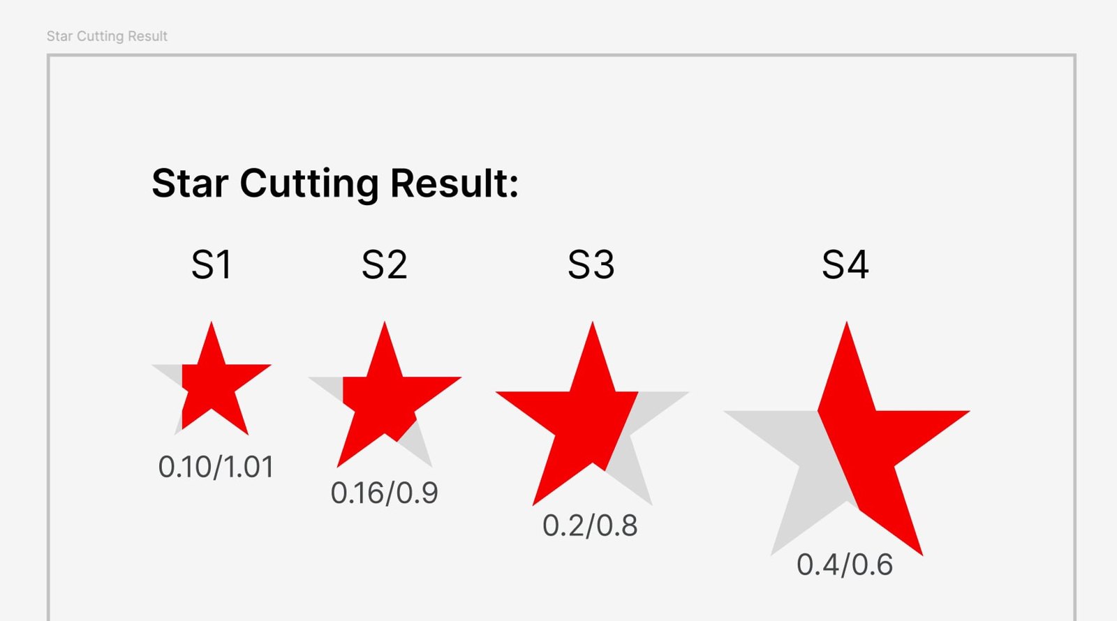
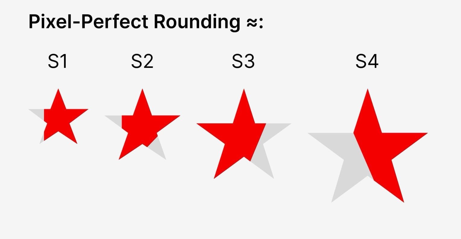
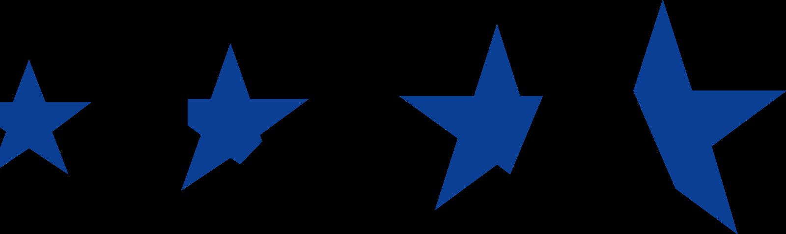
In May the stars came off the drawing board. Individual production files — one star per artboard, cut and cleaned — plus the full lineup and the wordmark on black. If you compare this row of four to today’s masthead you will notice the cuts are already close to final: the vertical slice on the small star, the big diagonal on the large one.

Chapter five: the month we did it properly (September 2025)
Here is the confession at the heart of this story: the cuts you just saw were drawn by eye and rounded to look right. The ratios were approximately golden. For a logo, that is normal. It bothered us anyway — this newsroom’s whole premise is that “approximately right” is a euphemism for wrong. So in September the logo went back to school.
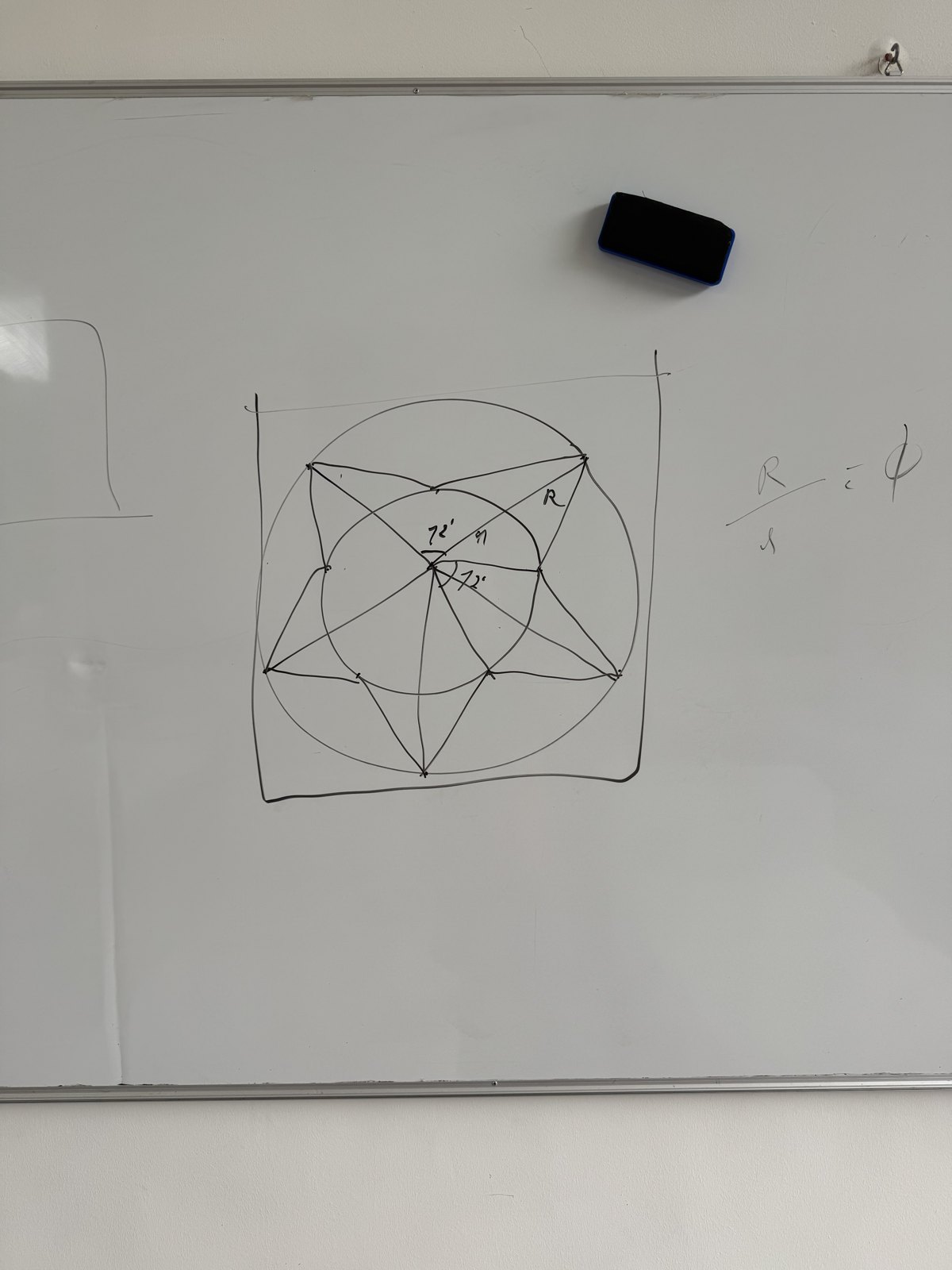
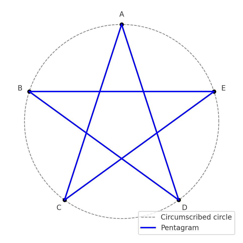
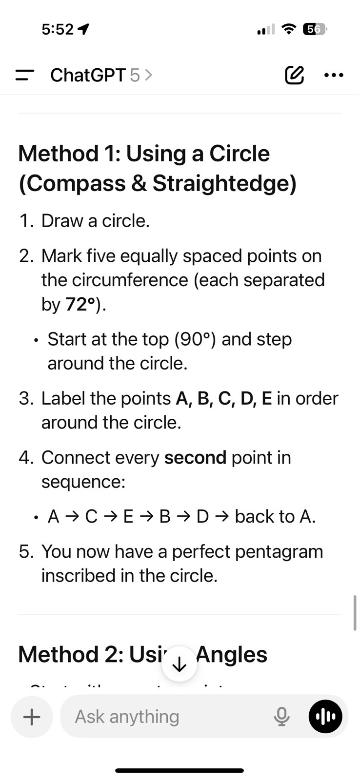
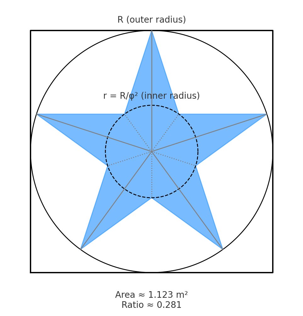
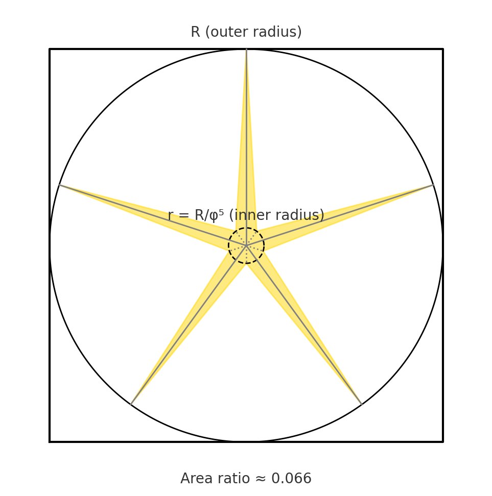
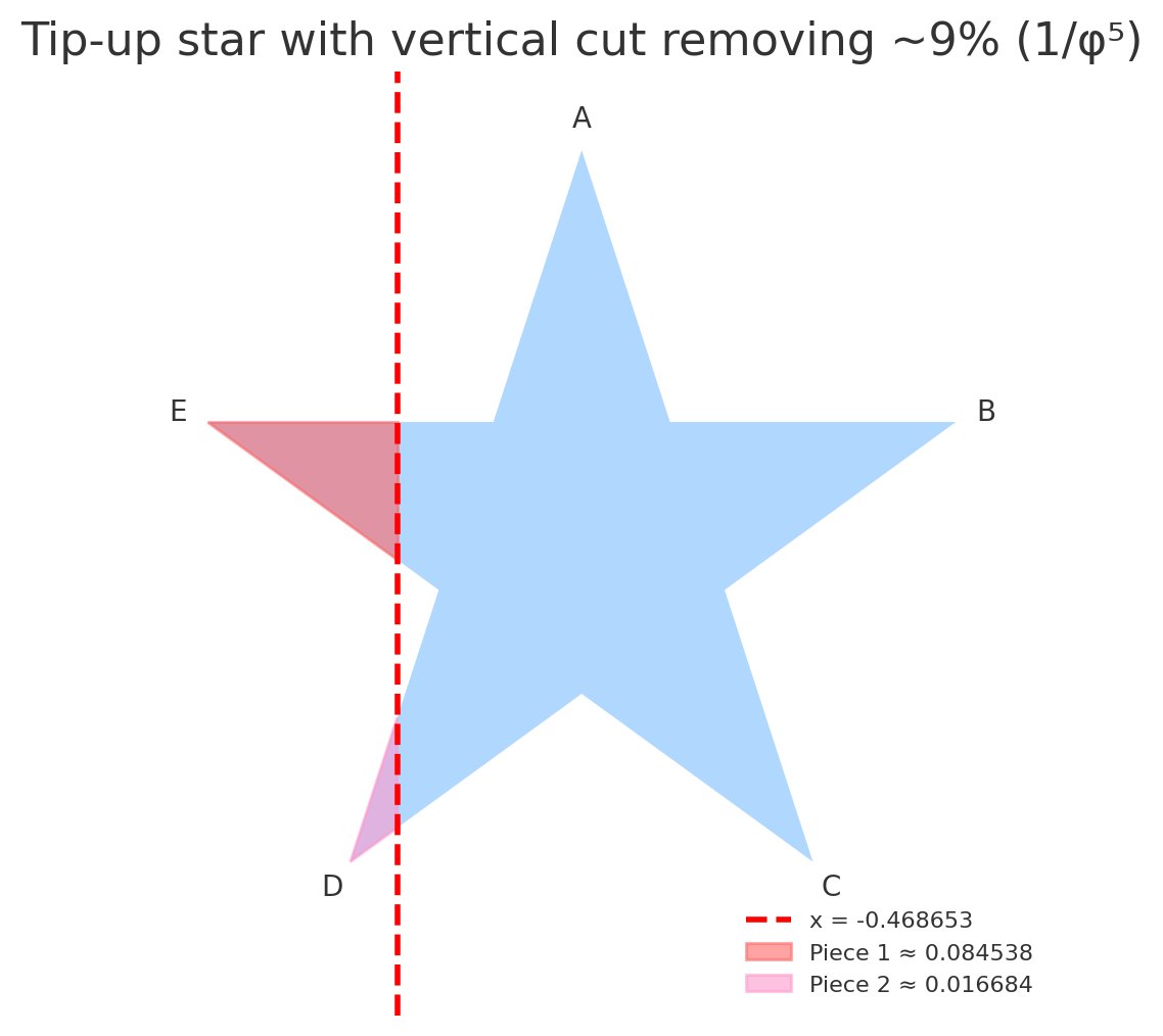
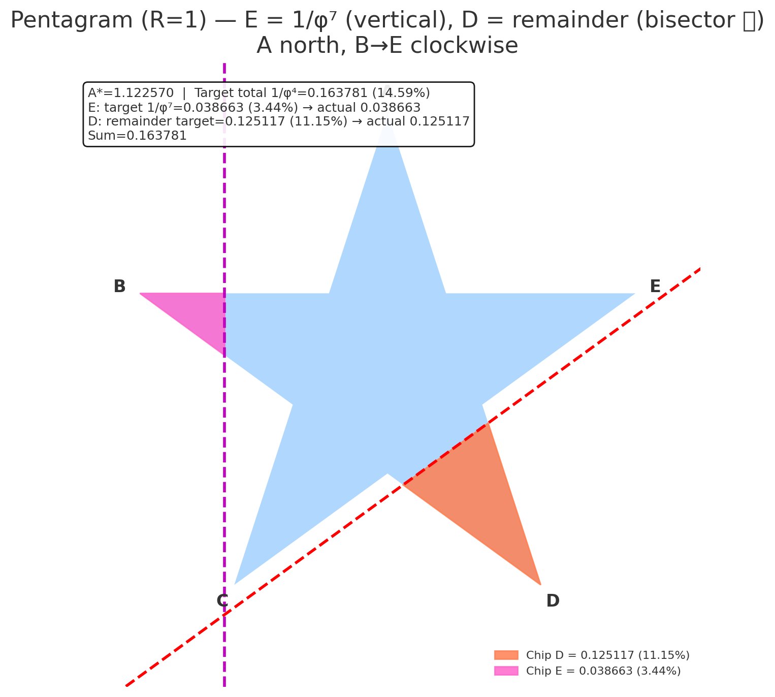
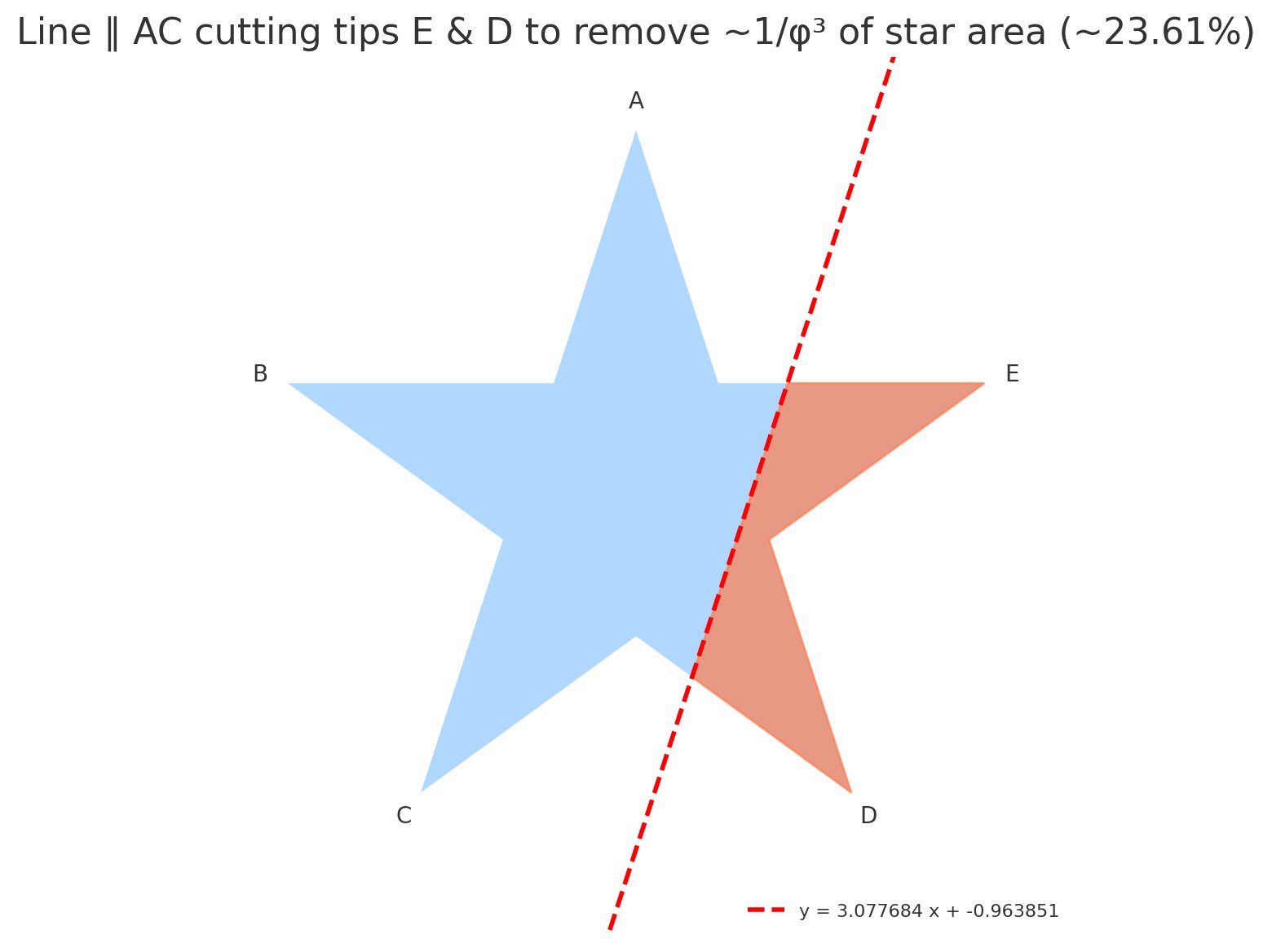
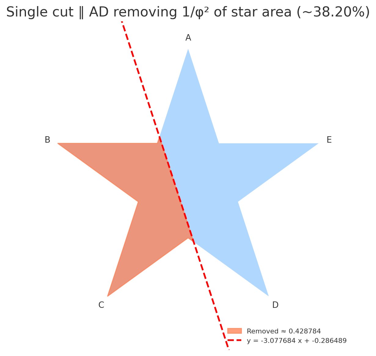
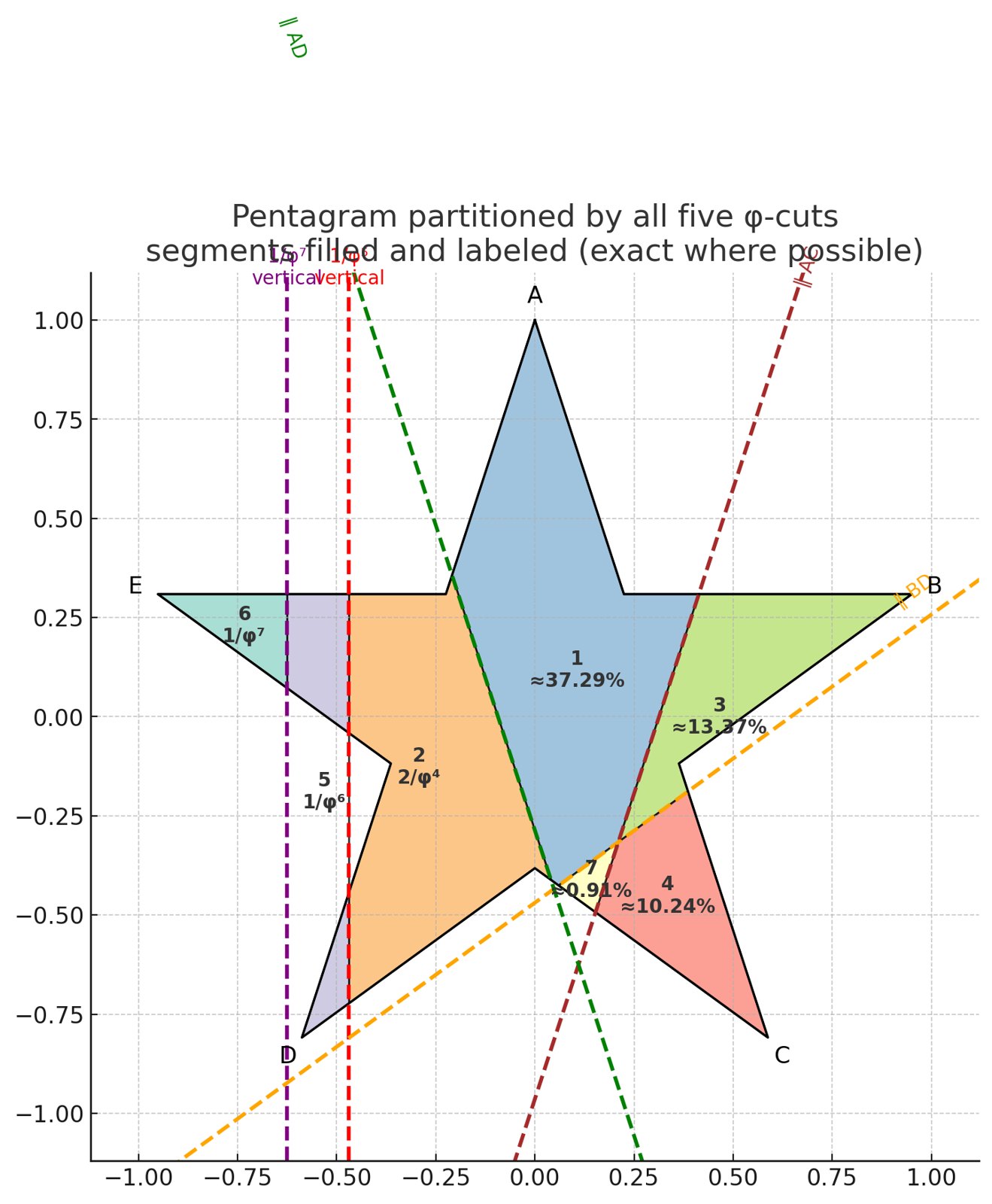
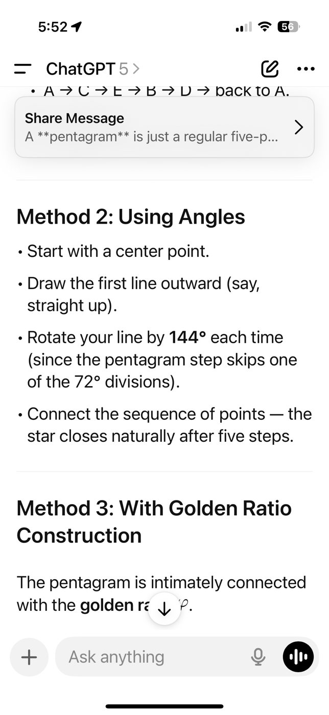
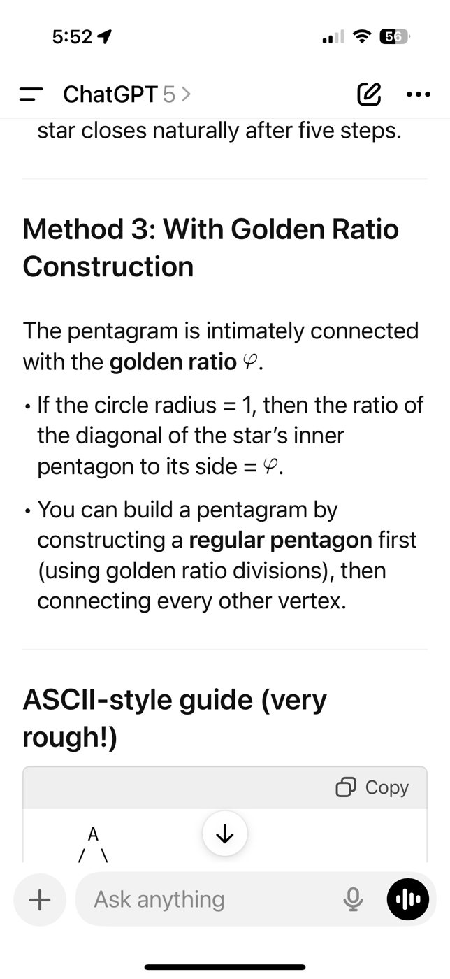
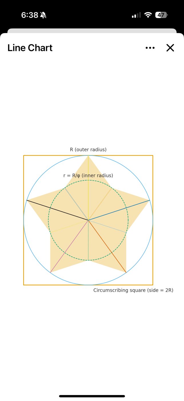
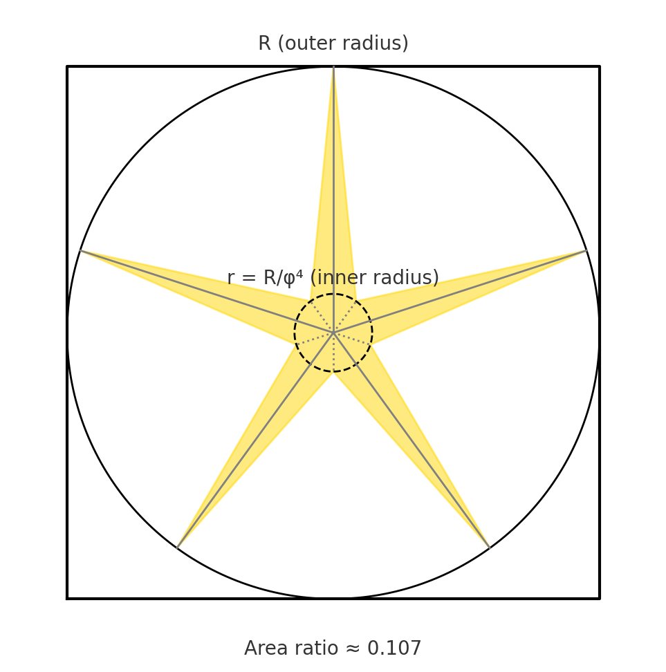
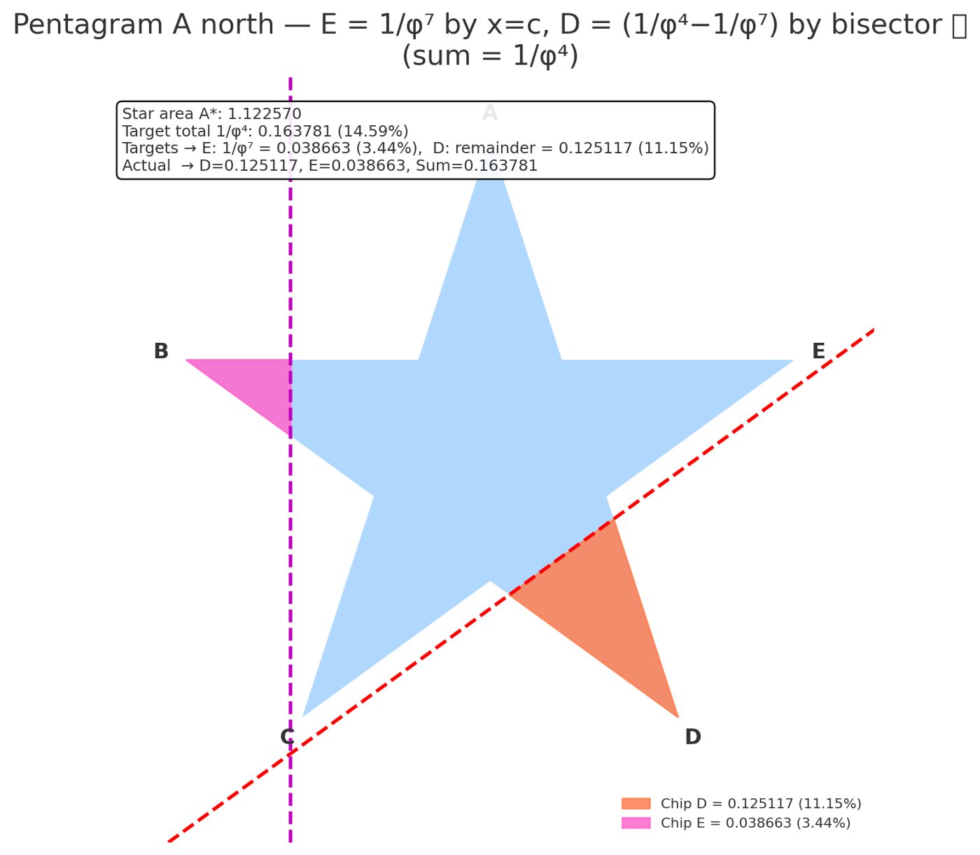
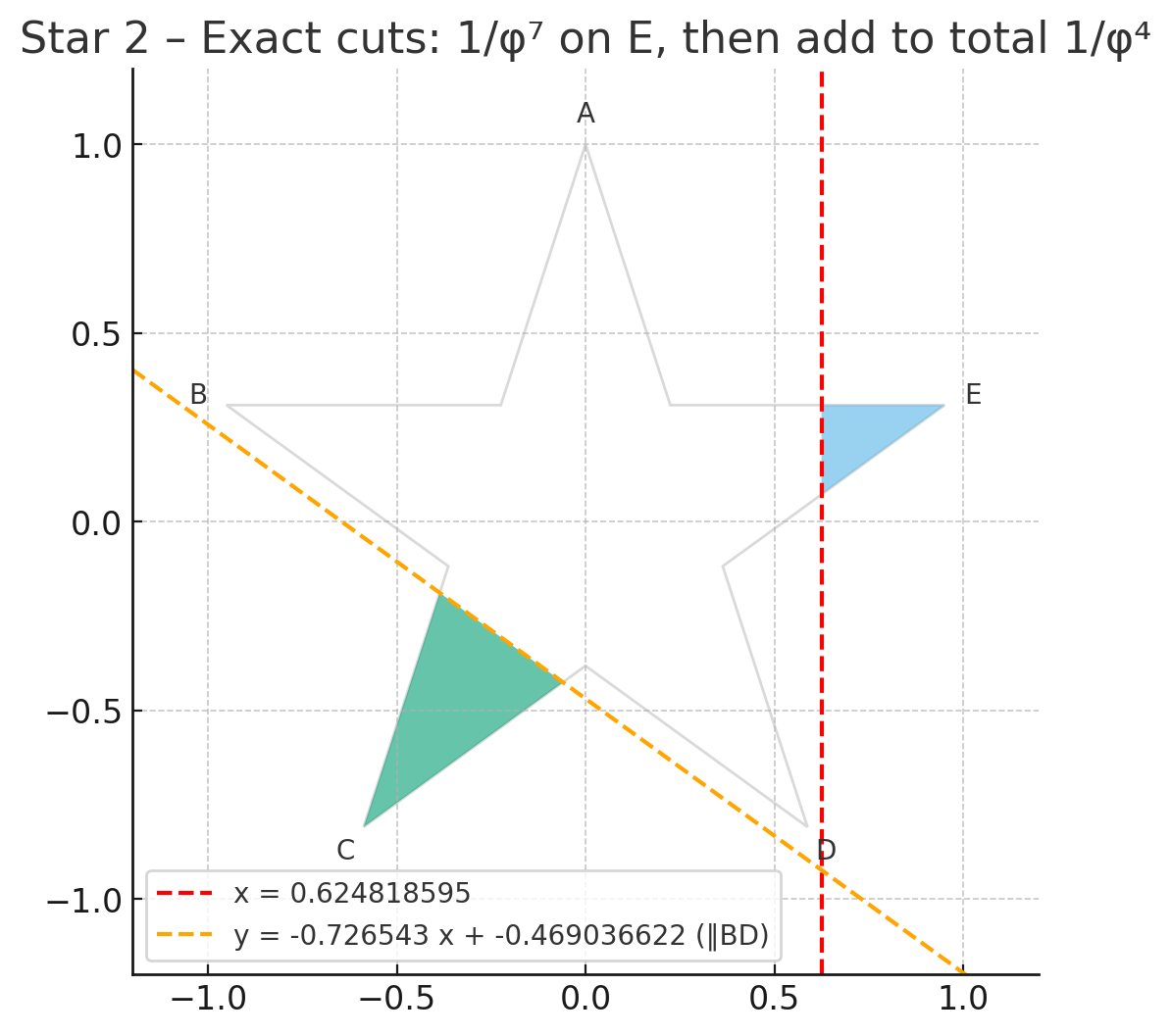
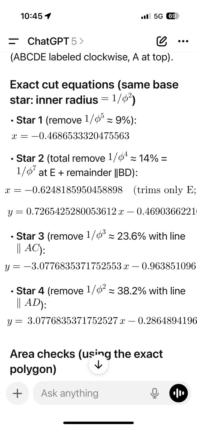
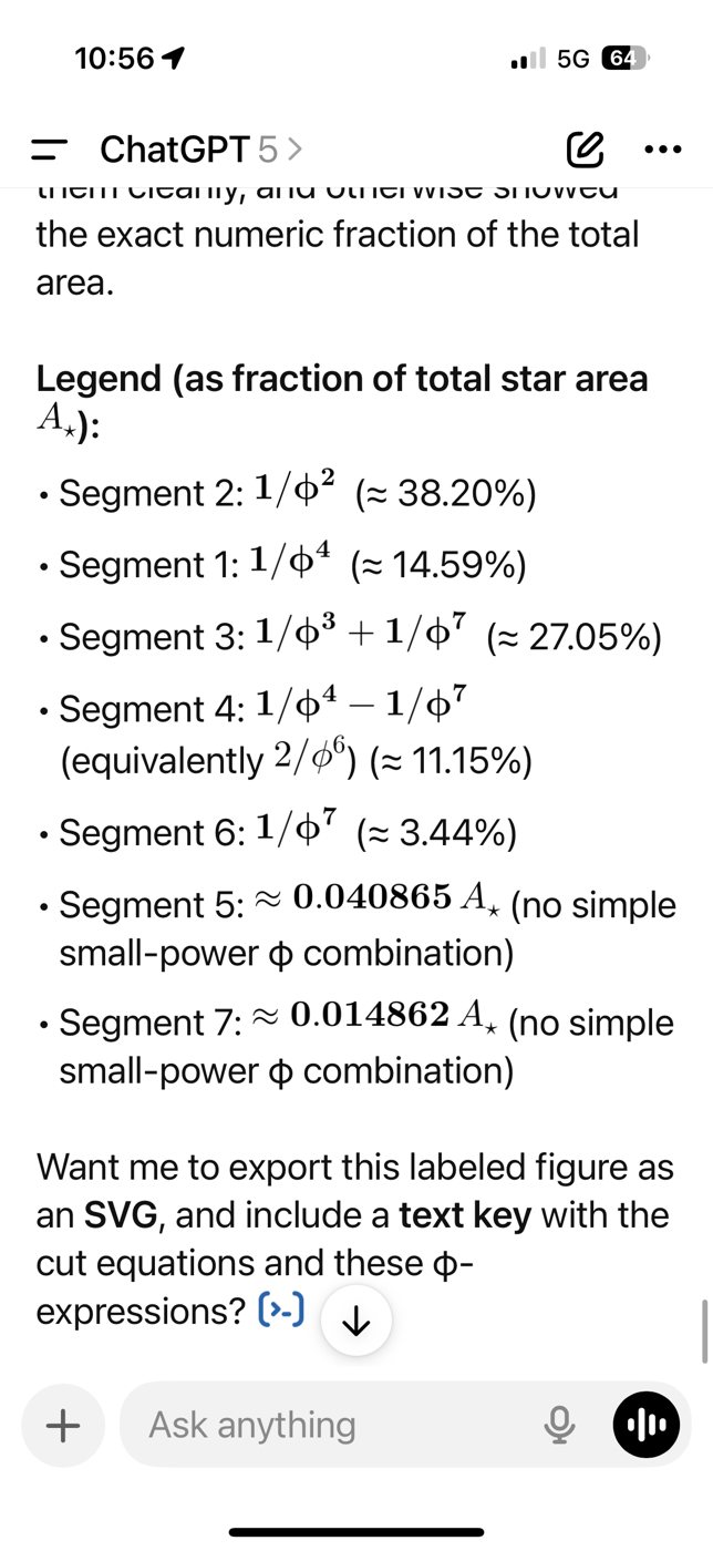
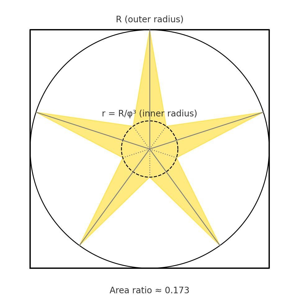
It started at the whiteboard, with a compass-and-straightedge pentagram, the way Euclid would have drawn it. It continued at 5:52 in the morning, arguing with a chatbot about construction methods. It produced page after page of studies: pentagrams inscribed in circles, star “fatness” experiments with the inner radius set to R/φ² down to R/φ⁵, and finally the exact cut equations — the vertical line at x = −0.468653… that removes precisely 1/φ⁵ of the star, the line parallel to chord AC that removes 1/φ³, the single diagonal parallel to AD that takes 1/φ², and the elegant two-chip construction where one tip gives up 1/φ⁷, another gives the remainder, and the pieces sum to exactly 1/φ⁴.
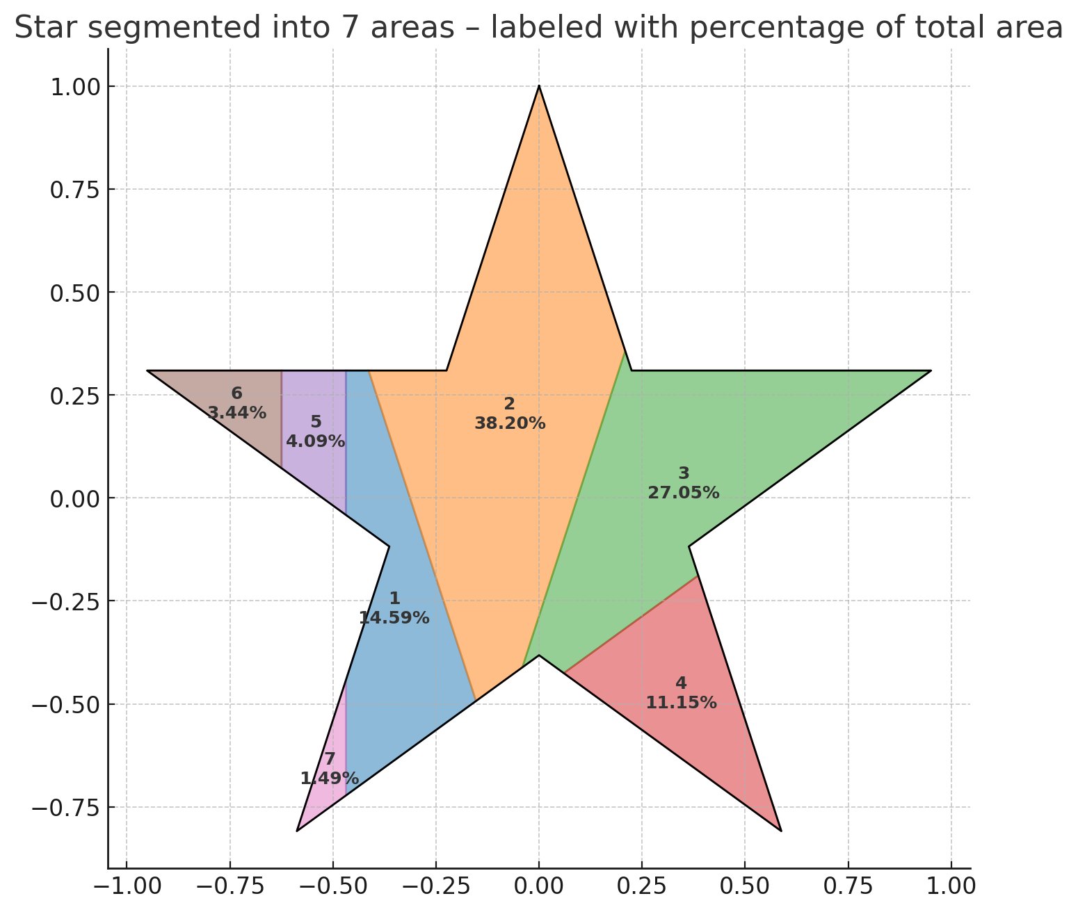
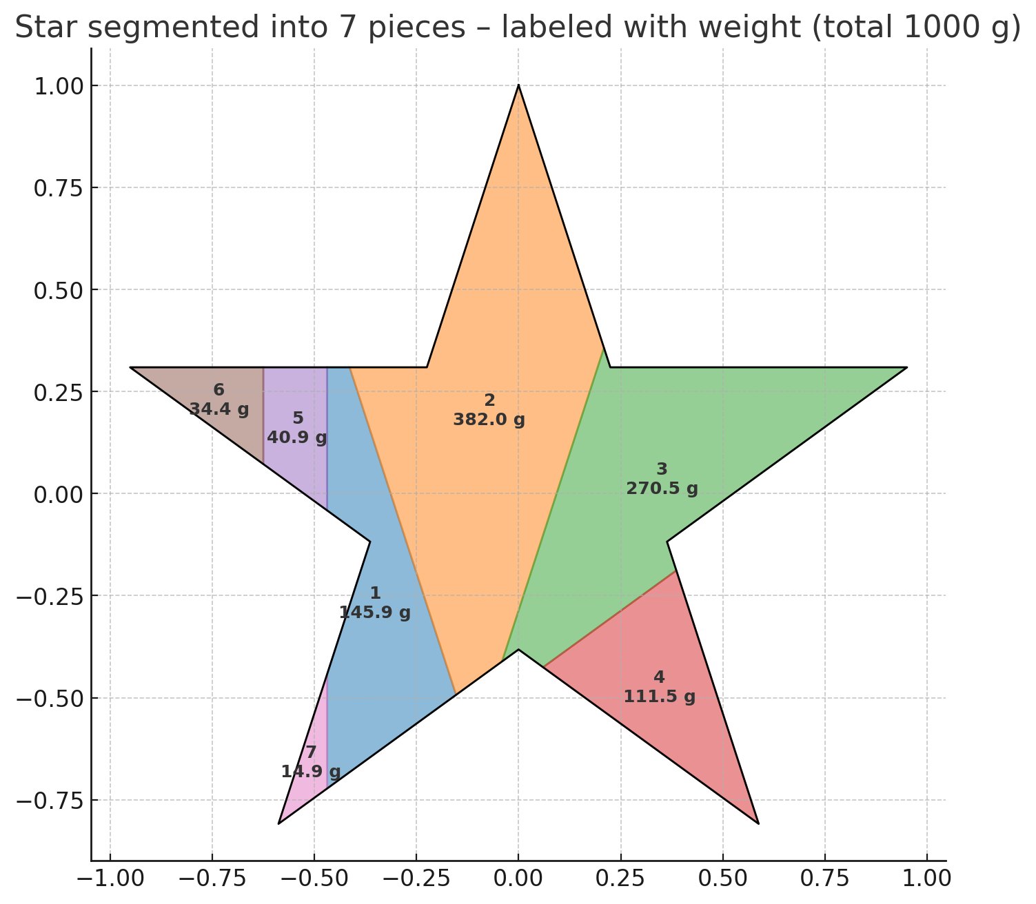
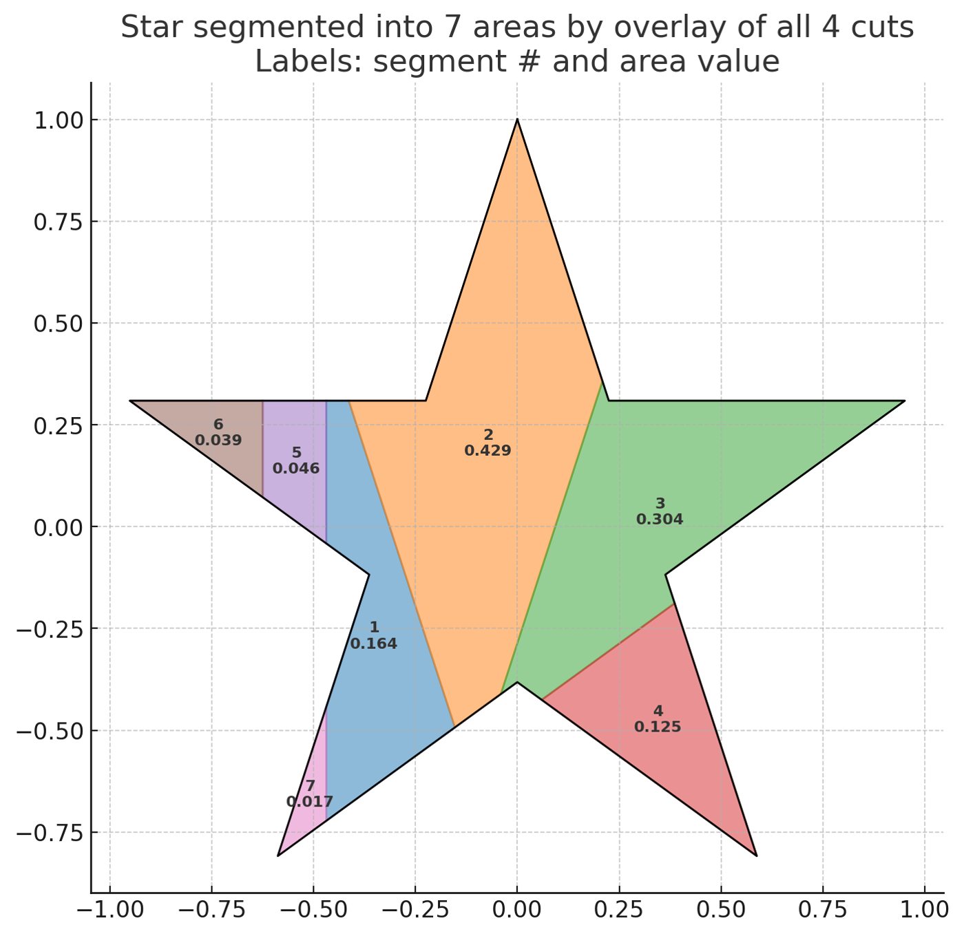
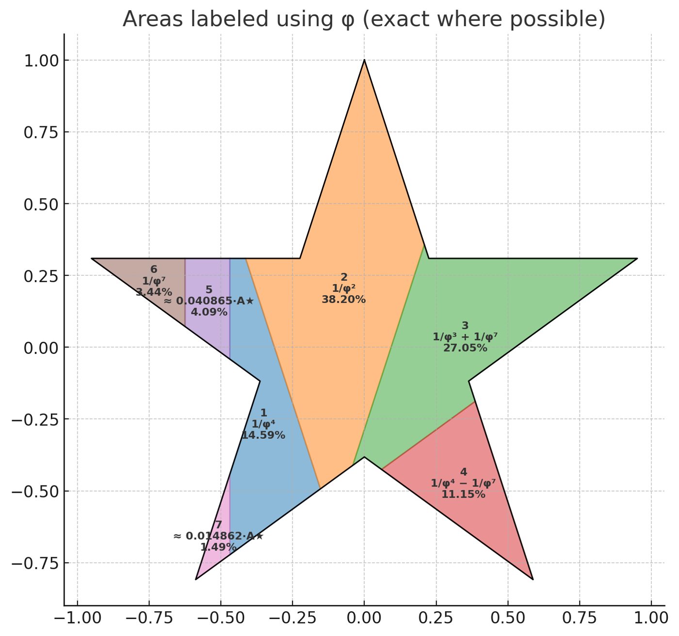
And then, because we could not stop, we overlaid all four cuts on a single star and watched it fall into seven pieces — each one labeled with its exact share of the whole, most of them clean powers of φ. Then we did what any newsroom that spends its days weighing sandwich prices would do: we assigned the star a weight of 1,000 grams and weighed the pieces. The big central chunk comes to 382 grams. Of course it does — 0.382 is 1/φ².
Chapter six: the flag goes in (October 2025)
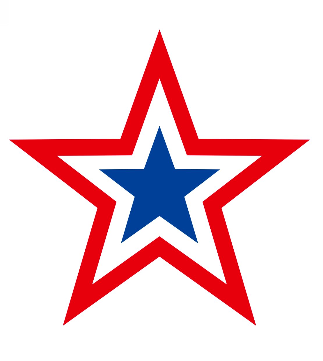
With the geometry finally honest, the dress went on: stars and stripes filling the letterforms, the four cut stars taking their places in and around the name. This is the wordmark you see at the top of this page — the same one specced at 644 pixels back in April, now with every star cut to a provable fraction.

Why the big star moved to the left
One composition decision deserves its own explanation, because it changed the logo late in the process. In early lockups the largest star, S₄, sat on the right end of the wordmark. It looked balanced on paper — until we superimposed the four cut stars to check how the cuts related to one another. Stacked on a common center, the left-side cuts nested cleanly: each cut line sat parallel to its neighbors, and the removed slices read as one family of strokes. With the big star cut on the right, the overlay produced a tiny residual sliver — a mean little off-cut that broke the rhythm and looked like an error at masthead sizes. The geometry voted, and the big star went left, its 1/φ² cut mirroring the others. That is why, in the final mark, S₃ and S₄ carry opposite-handed cuts — parallel to chords AC and AD respectively — instead of all four leaning the same way.
And one more piece of hidden geometry, for the readers who measure things: the stars are not just golden in size and cut — they are placed golden. Their vertical positions within the wordmark step by the same ratio, each star’s height in the lockup set by another rung of the φ-ladder that governs the letter spacing. Nothing in this logo is where it is by accident.
Chapter seven: shipping it (February 2026)
The last files in the folder are the least romantic and the most important: final production assets. The logo on black for dark contexts. Each cut star exported alone, at full resolution, edges clean, ready for the masthead, the app icon, the anchor of every chart the Data Desk publishes.


What the folder taught us
Eighteen months, forty-six files. A logo that began as a pencil wobble and ended as a theorem. The honest lesson of the archive is that the mathematics came last: first the instinct (a star in the name), then the craft (spec sheets and pixel grids), and only then the rigor — going back and replacing every “looks right” with an equation that is right. That is also, for what it’s worth, how we try to do journalism: notice something, write it down carefully, then prove it.
The full mathematics — why each star is φ times the last, why the offcuts are themselves stars from the family, and the one-line proof that what remains of the third star weighs exactly two of the first — is in the companion piece: The Secret in Our Stars.
Appendix: the complete archive
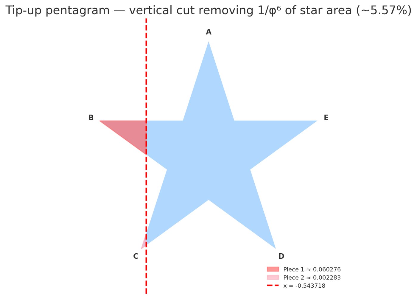
For the record — and because this newsroom does not believe in partial disclosure — here is everything else in the folder: the structure-grid variants, the first-generation cut stars, the rejected concentric study, the full 5 a.m. research pages, the rejected 1/φ⁶ cut, every partition study, and the final per-star production files. Two files are omitted: one empty, one byte-identical duplicate of the flag wordmark above.







About this archive. All images are from the USA Times design archive (September 2024 – February 2026), reproduced as found — all 45 usable files appear in this piece. Dates are file dates. Construction diagrams and cut equations were verified independently by the USA Times Data Desk; the solved cut line for S1 matches the archive value x = −0.468653 to six decimal places.